
Response Analysis
AssessFluence Dashboard visualizes assessment or form results and allows users to analyze them. Dashboards are available on Projects (Assessments), Campaigns (Responses) and Collections (Responses).
This help topic gives a brief overview of the chart types included. Each description includes illustrations and a list of supported question types.
Supported chart types:
- Bar
- Pie
- Doughnut
- Histogram
- Gauge
- Bullet
- Stacked bar
- Word cloud
- Text table
- Statistics table
- NPS visualizer
- Interactive filtering
- Customizable colors
- Dynamic layout
- Chart reordering via drag and drop
Bar Chart
A bar chart visualizes categorical data with rectangular bars. The length of each bar is proportional to the value it represents. AssessFluence Dashboard supports vertical and horizontal bar charts.
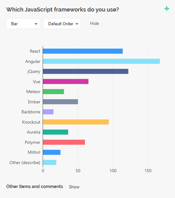
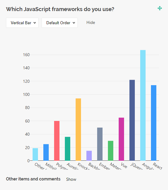
Bar charts are supported by the question types listed below:
- Radio Button Group
- Checkboxes
- Dropdown
- Multi-Select Dropdown (Tag Box)
- Image Picker
- Yes/No (Boolean)
- Single-Select Matrix
- Ranking
- Any of these question types used within a Multi-Select Matrix, Dynamic Matrix, or Dynamic Panel
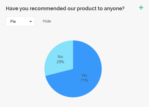
Pie Chart
A pie chart is a circular graph divided into slices that represent proportions of a whole. Pie charts are great for visualizing how each category contributes to a total. They work best with fewer categories because a bigger number of slices can make chart interpretation difficult.
Pie charts are supported by the following question types:
- Radio Button Group
- Checkboxes
- Dropdown
- Multi-Select Dropdown (Tag Box)
- Image Picker
- Yes/No (Boolean)
- Ranking
- Any of these question types used within a Multi-Select Matrix, Dynamic Matrix, or Dynamic Panel
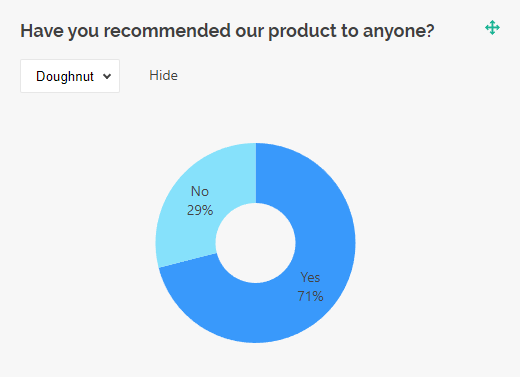
Doughnut Chart
A doughnut chart is a pie chart but with a blank center. This shape may help reduce visual clutter and draw viewer's attention to the length of the arc rather than the area of the slices.
Doughnut charts are supported by the following question types:
- Radio Button Group
- Checkboxes
- Dropdown
- Multi-Select Dropdown (Tag Box)
- Image Picker
- Yes/No (Boolean)
- Ranking
- Any of these question types used within a Multi-Select Matrix, Dynamic Matrix, or Dynamic Panel
Histogram
A histogram is a chart type that visualizes the distribution of a dataset. It divides a continuous data range into intervals and shows how many data points fall within each interval. Histograms support both vertical and horizontal views.
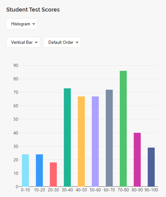
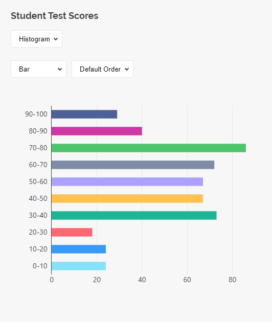
Histograms are supported by the following question types:
- Single-Line Input with
inputTypeset to"number","date", or"datetime" - Rating Scale
- Any of these question types used within a Multi-Select Matrix, Dynamic Matrix, or Dynamic Panel
Gauge Chart
A gauge chart is used to display a single numeric value, which is the average of a given dataset. The gauge chart takes the form of a semicircle with scale marks along the arc. Inside the arc is a needle or bar indicating the value.
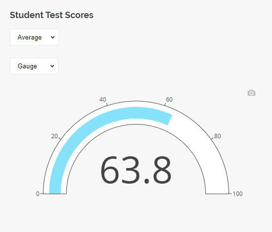
Gauge charts are supported by the following question types:
- Single-Line Input with
inputTypeset to"number" - Rating Scale
- Expression
- Any of these question types used within a Multi-Select Matrix, Dynamic Matrix, or Dynamic Panel
Bullet Chart
A bullet chart visualizes a single number on a horizontal strip. Similar to a gauge, it displays the average of a dataset, with the value indicated by a bar. The strip displays scale marks along its length, similar to the scale on a gauge's semicircle.
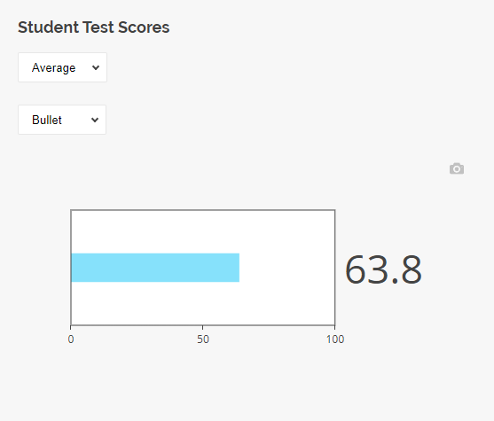
Bullet charts are supported by the following question types:
- Single-Line Input with
inputTypeset to"number" - Rating Scale
- Expression
- Any of these question types used within a Multi-Select Matrix, Dynamic Matrix, or Dynamic Panel
Stacked Bar Chart
A stacked bar chart displays each bar divided into multiple segments that visualize the percentage contribution of each category. The total length of bars represents 100%. Stacked bar charts are useful for showing the breakdown of a total into its individual components.
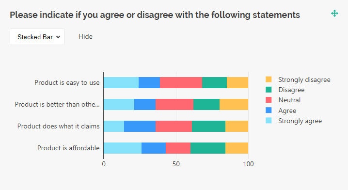
Stacked bar charts are supported by the following question types:
- Single-Select Matrix
Word Cloud
A word cloud (also "text cloud" or "tag cloud") visualizes textual data by adjusting the size of words based on their frequency. Word clouds are useful for analyzing large collections of textual data as they provide an immediate and illustrative summary of it.
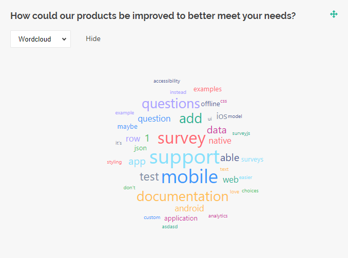 Word clouds are supported by the following question types:
- Single-Line Input
- Long Text
- Multiple Textboxes
- Any of these question types used within a Multi-Select Matrix, Dynamic Matrix, or Dynamic Panel
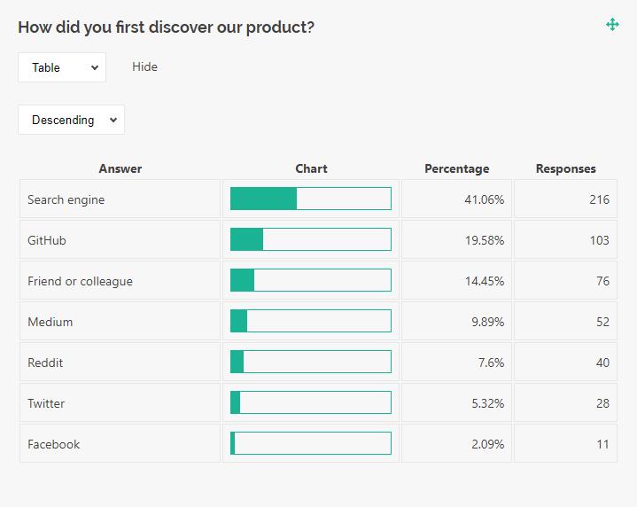
Text Table
A text table is a visualization type that displays textual data in a simple table, without applying any data aggregation.
Text tables are supported by the following question types:
- Single-Line Input
- Long Text
- Multiple Textboxes
- Any of these question types used within a Multi-Select Matrix, Dynamic Matrix, or Dynamic Panel
Statistics Table
A statistics table is a visualization type that aggregates data from single- and multi-select questions and displays it in a tabular format.
Statistics tables are supported by the following question types:
- Radio Button Group
- Checkboxes
- Dropdown
NPS Visualizer (Request access)
An NPS visualizer is a chart designed specifically for Net Promoter Score (NPS) questions. NPS measures customer loyalty and identifies business growth opportunities. Respondents rate how likely they are to recommend your product or service on a scale from 0 to 10.
- Promoters (score 9-10) are most likely keep buying your product and bring new customers.
- Passives (score 7-8) are overall satisfied with your product but may switch to your competitors if they come across a more attractive offering.
- Detractors (score 0-6) are unhappy with your product and may damage your brand through negative word-of-mouth.
To calculate the NPS, the percentage of detractors should be subtracted from that of promoters.
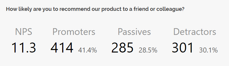
The NPS visualizer is supported only by Rating Scale questions, standalone or used within a Multi-Select Matrix, Dynamic Matrix, or Dynamic Panel.